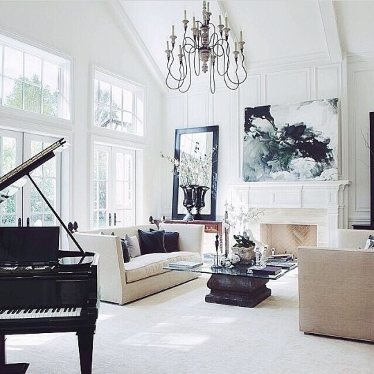
yep, this makes me happy...no messes anywhere, no stacks of mail, no piles of
unread magazines, no doggie toys.
however, there are also no living plants, no signs of human life, not even a pillow askew...
a set.
one with square-edged sofas, square edged table, square sharp-edged everything...
in other words: no softness.
except for the exceptionally beautiful chandelier and the open-topped piano.
tell me, what do you think?
the TRUTH, please.
xx's

Tiny bit too sterile for me. I look with envy at the Roche Bobois ads, with their impeccable models in impeccable settings, and wish I could be that. But my real life is messier, and I don't want to make it perfect if aesthetic perfection would ruin the laughs about the imperfections. I prefer smiling to winning.
ReplyDeleteAlso, we don't all have amazing windows like in this photo.
Yes Marsha it is pristine but add a happy couple and watch the room unfold into a lovely capture of living life in comfort and joy.
ReplyDeletexx,
Vera
It's so you pretty and elegant Marsha!
ReplyDeleteHave a lovely evening.
FABBY
I think it would be perfect with a single pop of color and as you said, something living. Otherwise gorgeous.
ReplyDeleteSterile, sharp, but pretty in its own way.
ReplyDeleteSimple, elegant, and sophisticated! Yes please.
ReplyDeleteSharon
The House of Hampton
Each piece of furniture and all of the objects are beautiful. But, as they are, only objects. The room needs life.
ReplyDeleteLovely room but it looks too 50's or 60's. My mom and grandparents decorated like this, All white. Mom said that the color could come on the pillows or art on the walls. I do love that there is no mess anywhere.
ReplyDeleteI actually love this with the exception of the coffee table, I find the sharp corners of the glass just a little too harsh and I think the whole room could be softened whilst keeping the elegance by changing this.
ReplyDeleteGorgeous to look at but not comfy or cozy enough for me.
ReplyDeleteBeautiful, but I'd be so afraid to drink coffee or red wine here.
ReplyDeleteWhen I look at that room, I have no sense of the person who lives there. Truthfully, it is devoid of character...looks like it is trying to be someone else, perhaps. Things can be simple and somewhat minimalist but still give a hint about the person who lives there, this room doesn't achieve that. Some of the more memorable homes I've visited offer a biography of their inhabitants: places they've been, books they like to read, art that inspires and speaks to their souls, colors that define their attitudes, design that tells me if they value history, or would rather contemplate the future. I think we all desire order, less clutter, etc., but we needn't strip our souls to achieve that. For me, if you haven't guessed already, this room is devoid of life.
ReplyDeleteThis room speaks to me, lots of light and a sense of order.
ReplyDeleteLove it but it needs one color somewhere, perhaps the coffee table base? It also strikes me as very male - too one-sided, sorta.
ReplyDeletesouless
ReplyDeleteNO SOUL
ReplyDeleteNO LIFE!
I surely hope they do not drink red wine! Love the paint color.
ReplyDeleteLinda Klinger
Nice space and light and windows -- the clean lines are calming. But cold, sterile, overly tidy. No plants, as you say, nothing askew, no rounded edges. That chandelier is a dust-magnet so up high. No books! And I wonder about the resonance of a piano on a floor that appears carpeted.
ReplyDeleteNot a room for living in, it could just as well be a doctor's waiting room.